Now, when you’re sitting in the cockpit of the Prius you immediately understand that you are in ethereal machine.
You feel bad for wearing leather;
You suddenly want to become a vegan;
You are unknowingly planning your pilgrimage east to find enlightenment.
All of this goes away however, when you push the giant computer looking power button and a bunch of cool things light up and beep. There is a large information screen surrounded by buttons in the center of the dash. The area directly in front of the steering wheel where you would usually find your gauges(an area I like to refer to as the ‘Naked Mole Rat region’ of this vehicle) is devoid of anything but dark, matted, plastic dash material. There is a digital readout very near the windshield of the car, very near to one’s line of sight. Although this is out of the ordinary, I found it very convenient and unobtrusive to the driving experience. The dashboard also contains a radio with very few buttons, leading one to assume that it is voice activated. After barking commands at the radio for 5 min and then expressing my relational troubles to it for the next half an hour, I found that the Prius audio system, to my dismay, is NOT voice activated.
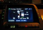
The Information screen is the centerpiece of the dash for sure, if not the centerpiece of the car itself. One screen option graphs the last 30min of driving activity and efficiency. Another screen, fascinating to me, offered instant MPG readouts and funky little graphics of turning wheels, turning motors, and exciting, dotted lines in motion that connected them all. This screen showed where and when the power was being produced and regenerated; it was energy porn in the purest sense. There is also GPS navigation available on the Information screen, as well as climate control and Audio settings. All in all, there is enough gadgetry there to keep two teenage chimps busy for 5-7 min. It kept me busy for about 13 hours.

No comments:
Post a Comment